
About
Artist Bio
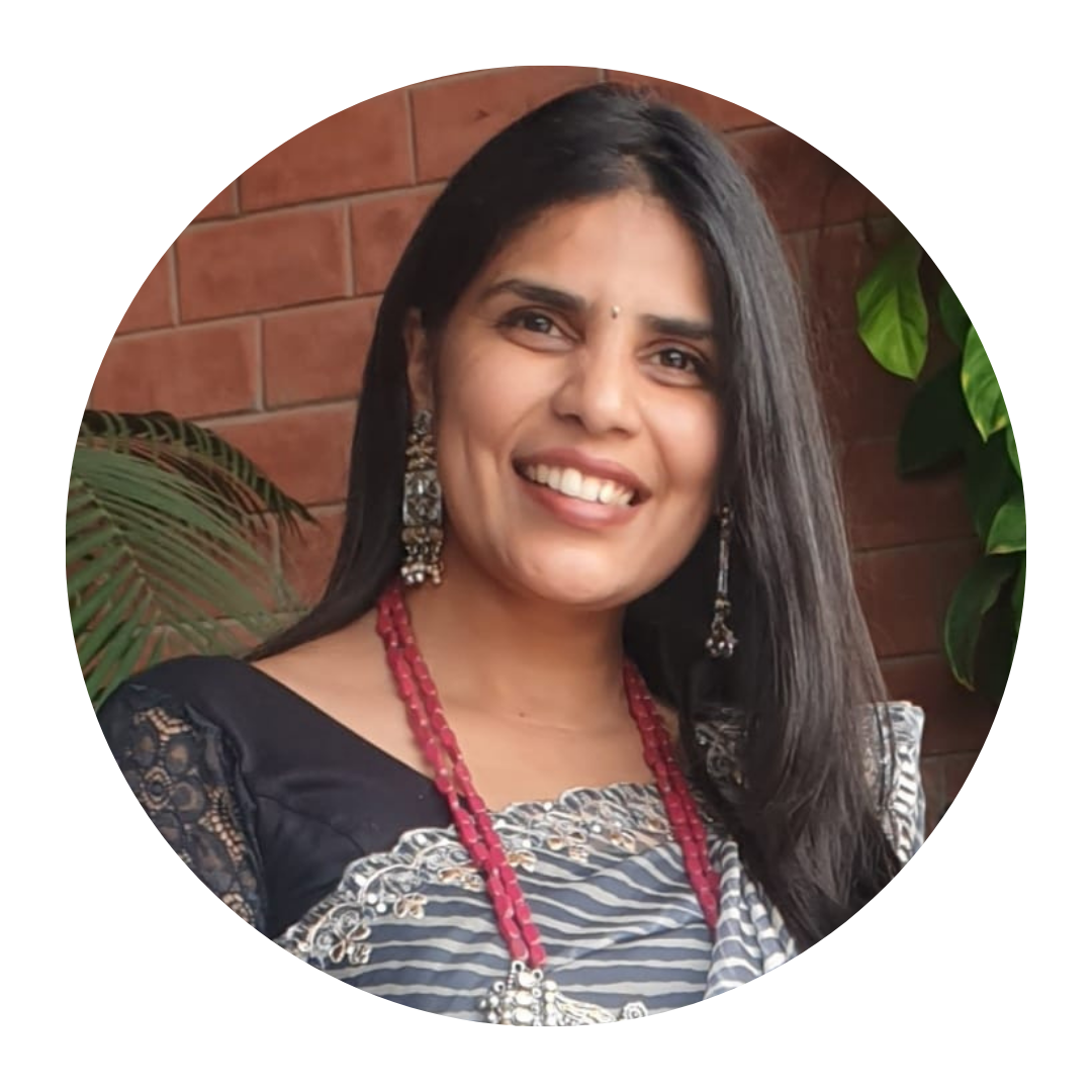
Ritu Lahoti is a visual artist from Indore, Madhya Pradesh, trained at the Government Institute of Fine Arts, Indore. Her work has been selected for national and state exhibitions in New Delhi, Bhopal, and Mumbai, and she has participated in international residencies and exhibitions.
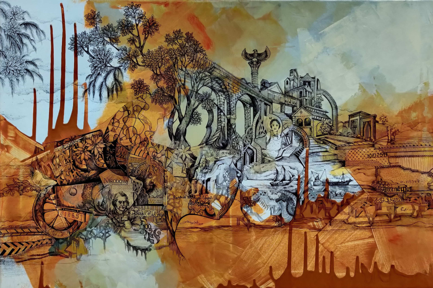
Her current body of work draws on the visual language of banknotes — engraved borders, textures, denomination marks, and emblems — pulling details from multiple currencies and recomposing them into invented notes that carry her own imagery instead. Working primarily in pen and ink on Canson paper, often in black and white, she is now beginning to bring color into the work as well.
Ritu Lahoti is a visual artist from Indore, Madhya Pradesh, trained at the Government Institute of Fine Arts, Indore. Her work has been selected for national and state exhibitions in New Delhi, Bhopal, and Mumbai, and she has participated in international residencies and exhibitions.
Her current body of work draws on the visual language of banknotes — engraved borders, textures, denomination marks, and emblems — pulling details from multiple currencies and recomposing them into invented notes that carry her own imagery instead. Working primarily in pen and ink on Canson paper, often in black and white, she is now beginning to bring color into the work as well.
Concept Note
Money is one of the few symbols everyone reads the same way, without being taught to. A banknote’s borders, portraits, and emblems exist for one purpose: to be trusted at a glance, no questions asked. That unquestioned trust is what I am actually interested in — not currency itself, but what happens when a symbol of value gets accepted automatically, and what gets pushed out of frame in return.
This comes from somewhere specific. Growing up, I watched almost everything — a wish, a plan, a simple outing — get measured against whether there was money for it. Desire always arrived second to survival, and I watched my parents work hard just to close that gap. That early, constant math between wanting and affording is what first made me look at a banknote not as paper, but as the thing every dream in the house had to pass through.
I take that structure apart and rebuild it. Working from details across different countries’ notes — a border pattern, a script, a numeral style — I recompose them into currencies that don’t exist, and replace the state’s chosen imagery with my own. What I put back in is usually nature: birds, florals, animals. I keep returning to that because I think of nature as what quietly absorbs the cost of the materialism these notes stand for — present in the economy, generating value, and almost never credited for it.
I work mostly in pen and ink on Canson, often in black and white, because the hand-built, irregular texture I build up is meant to feel physical and made — the opposite of a real note’s mechanical, engineered surface, which exists only to be verified and trusted. I am now starting to bring in color as well, the way a real note carries a band or panel of color alongside its printed detail.
What I want a viewer to do is simple: recognize “banknote” first, then slow down enough to notice that nothing inside it is real — and sit with that gap for a second before deciding what it means. I am not trying to hand them a conclusion about materialism; I want the piece to make them run their own version of that question.
Money is one of the few symbols everyone reads the same way, without being taught to. A banknote’s borders, portraits, and emblems exist for one purpose: to be trusted at a glance, no questions asked. That unquestioned trust is what I am actually interested in — not currency itself, but what happens when a symbol of value gets accepted automatically, and what gets pushed out of frame in return.
This comes from somewhere specific. Growing up, I watched almost everything — a wish, a plan, a simple outing — get measured against whether there was money for it. Desire always arrived second to survival, and I watched my parents work hard just to close that gap. That early, constant math between wanting and affording is what first made me look at a banknote not as paper, but as the thing every dream in the house had to pass through.
I take that structure apart and rebuild it. Working from details across different countries’ notes — a border pattern, a script, a numeral style — I recompose them into currencies that don’t exist, and replace the state’s chosen imagery with my own. What I put back in is usually nature: birds, florals, animals. I keep returning to that because I think of nature as what quietly absorbs the cost of the materialism these notes stand for — present in the economy, generating value, and almost never credited for it.
I work mostly in pen and ink on Canson, often in black and white, because the hand-built, irregular texture I build up is meant to feel physical and made — the opposite of a real note’s mechanical, engineered surface, which exists only to be verified and trusted. I am now starting to bring in color as well, the way a real note carries a band or panel of color alongside its printed detail.
What I want a viewer to do is simple: recognize “banknote” first, then slow down enough to notice that nothing inside it is real — and sit with that gap for a second before deciding what it means. I am not trying to hand them a conclusion about materialism; I want the piece to make them run their own version of that question.